FREE COURSE · ENGLISH + العربية
Watch the YouTube lesson
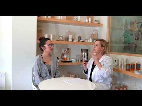
Video lesson: Makeup Artist Color Theory: A 10 Minute Introduction & Tutorial — K. M. Makeup & FX. Embedded from the original YouTube channel.
Colour theory helps artists make intentional choices instead of relying on guesswork. This course covers practical colour relationships for makeup and photography. Results vary by lighting, skin tone, product formula and individual preference.
Learning outcomes
- Use hue, value and saturation vocabulary.
- Understand warm, cool and neutral colour relationships.
- Use complementary colours thoughtfully.
- Choose blush, lip and eye combinations with a clear design goal.
- Evaluate makeup in more than one lighting condition.
1. The three useful dimensions
Hue is the colour family, such as red, yellow or blue. Value describes how light or dark a colour appears. Saturation describes how vivid or muted it is. When a makeup look feels unbalanced, identify which dimension needs adjustment before changing every product.
2. Warm, cool and neutral relationships
Warm colours often lean toward yellow, orange or red; cool colours lean toward blue, violet or some blue-based reds. Neutral combinations balance these directions. Skin undertone is not the same as surface redness or depth. Use these ideas as a flexible guide, not a rigid rule.
3. Complementary colour and correction
Colours opposite one another on a traditional colour wheel can visually reduce each other’s intensity when layered appropriately. Green-based correctors are sometimes used to visually soften the appearance of redness; peach or orange tones may be selected for some blue or purple shadows depending on depth. Use a very small amount, place it only where needed, and test under natural light. Colour correction is optional and should never become a reason to apply a thick layer over the whole face.
4. Build a cohesive palette
Choose one focal point: eyes, lips or cheeks. Repeat one colour family subtly across two areas to create harmony. Balance a vivid eye with a quieter lip, or use a bold lip with restrained eye definition. Consider clothing, event, lighting and client preference.
5. Practice studio exercise
- Create three small palettes: warm, cool and neutral.
- For each, select one eye colour, one blush family and one lip family.
- Photograph swatches in daylight and indoor light.
- Adjust value or saturation rather than replacing the entire palette.
Knowledge check
What is value? Lightness or darkness. What does saturation describe? Colour intensity. Why test in different light? Lighting changes how colours appear.
نظرية الألوان لفناني المكياج
تساعدك نظرية الألوان على اختيار درجات متناسقة للمكياج بدلاً من التخمين. النتائج تختلف حسب الإضاءة ودرجة البشرة وتركيبة المنتج.
أهداف الدورة
- فهم درجة اللون وقيمته وشدته.
- التعرف على العلاقات الدافئة والباردة والمحايدة.
- استخدام الألوان المتقابلة في التصحيح بحذر.
- تنسيق ظلال العيون وأحمر الخدود والشفاه.
1. أبعاد اللون
درجة اللون تحدد عائلته مثل الأحمر أو الأصفر أو الأزرق. القيمة تعني مدى الفتح أو الغمقان، أما التشبع فيعني قوة اللون أو هدوءه. عندما يبدو المكياج غير متوازن، حدد العنصر الذي يحتاج تعديلاً قبل تغيير كل المنتجات.
2. الدرجات الدافئة والباردة
تميل الألوان الدافئة إلى الأصفر والبرتقالي والأحمر، بينما تميل الباردة إلى الأزرق والبنفسجي وبعض درجات الأحمر. الاندرتون ليس هو نفسه احمرار سطح البشرة أو عمق لونها، لذلك استخدم هذه القواعد كدليل مرن.
3. تصحيح الألوان
قد تساعد الألوان المتقابلة على عجلة الألوان في تقليل ظهور شدة اللون بصرياً. يستخدم المصحح الأخضر أحياناً لتخفيف مظهر الاحمرار، بينما قد تناسب درجات الخوخي أو البرتقالي بعض الظلال الزرقاء أو البنفسجية وفق عمق اللون. استخدم كمية صغيرة وفي موضع محدد واختبر النتيجة في ضوء طبيعي.
4. تنسيق لوحة متكاملة
اختر نقطة تركيز واحدة: العينان أو الشفاه أو الخدان. كرر عائلة لونية بشكل بسيط في منطقة ثانية لتحقيق الانسجام، وراعِ الملابس والمناسبة والإضاءة ورغبة العميلة.
التطبيق العملي
- أنشئ ثلاث لوحات: دافئة وباردة ومحايدة.
- اختر لكل لوحة لوناً للعين والخد والشفاه.
- اختبر العينات في ضوء النهار والإضاءة الداخلية.
- عدّل قيمة اللون أو شدته عند الحاجة.
اختبار: القيمة تعني الفتح والغمقان، والتشبع يعني شدة اللون.